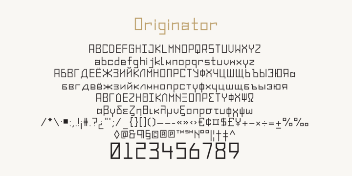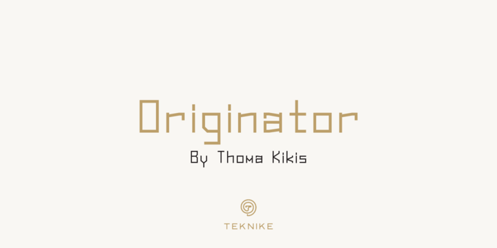
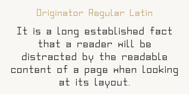
Originator is a display modular monospace font. The typeface has a distinct technical geometry using sharp angled corners. "Originator" name is derived from Latin and means 'one who first creates or initiates something into existence.' Originator is recommended for display work, branding, logos, technical writing, team sports, aerospace, aviation, automotive, racing, fashion, cinema, architecture, invitations, posters and headings.
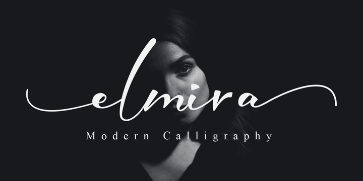
Download Elmira Font Family From Nissa Nana
May 28, 2019
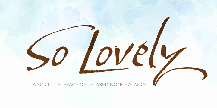
Download So Lovely Font Family From Positype
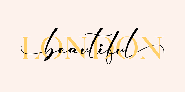
Effortless, personal, nonchalant. So Lovely just slides into the room, without a care in the world, flowing from one letter to the next.
This simple typeface has a secret—behind that nonchalant attitude is a ton of Stylistic, Swash, and Titling Alternates. It even contains 44 special ligature combinations to insure you have the smoothest entrance possible.
So Lovely is the third release of the Positype Relaxed Script Collection of typefaces—all focused on fluid, effortless script fonts for simple use.
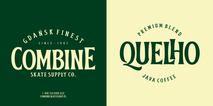
Download Obsypac Font Family From Fontdation
Introducing Obsypac, our latest vintage serif. Inspired by the old lettering/signpainting, refined to make it relevant in this modern era. This all-caps font will give a strong and clean look on your design, make it work perfectly for headlines, logos/logotypes, labels and packagings, t-shirt designs, etc. If you're a fan of classic typography, make sure you add this font to your design toolbox.
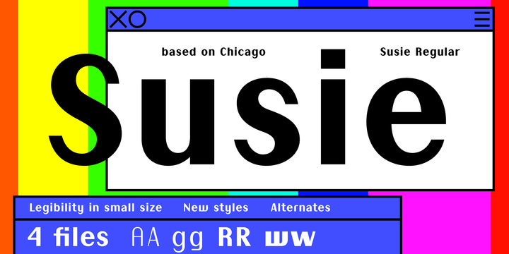
Download Susie Font Family From Caron twice
May 28, 2019
Susie specimen.pdf
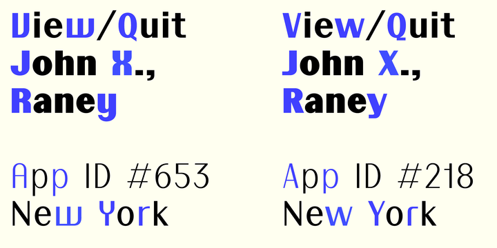
Susie is inspired by Chicago — a custom typeface for Apple Computer, Inc. designed by Susan Kare in 1984. Chicago was part of the Apple identity and a primary typeface in the breakthrough of Macintosh & iPod. And also a free typeface for users of Macintosh MacPaint and MacWrite. Susie shows a more contemporary look on this bitmap typeface.
It honors the horizontal to vertical stroke width ratio. Optically it keeps the inner whitespace the same size and changes its treatment of round shapes. These forms, which seem round at the smallest sizes of the bitmap version, are strictly rounded. A fundamental change can be found in the diacritics, which are darker and more compactly connected to the character. The typeface has a very specific character that in itself attracts attention. As such it is ideal in places where something needs to be emphasised. It’s also a good choice for setting short texts. In small sizes it is still legible.
Subscribe to:
Posts
(
Atom
)